branding // mike’s liquors
mike’s is a kansas city liquor store that’s known for its great selection. and its owner’s sarcastic disposition. for their rebrand, we gave them a new look, voice and identity uniquely fitted to that persona.

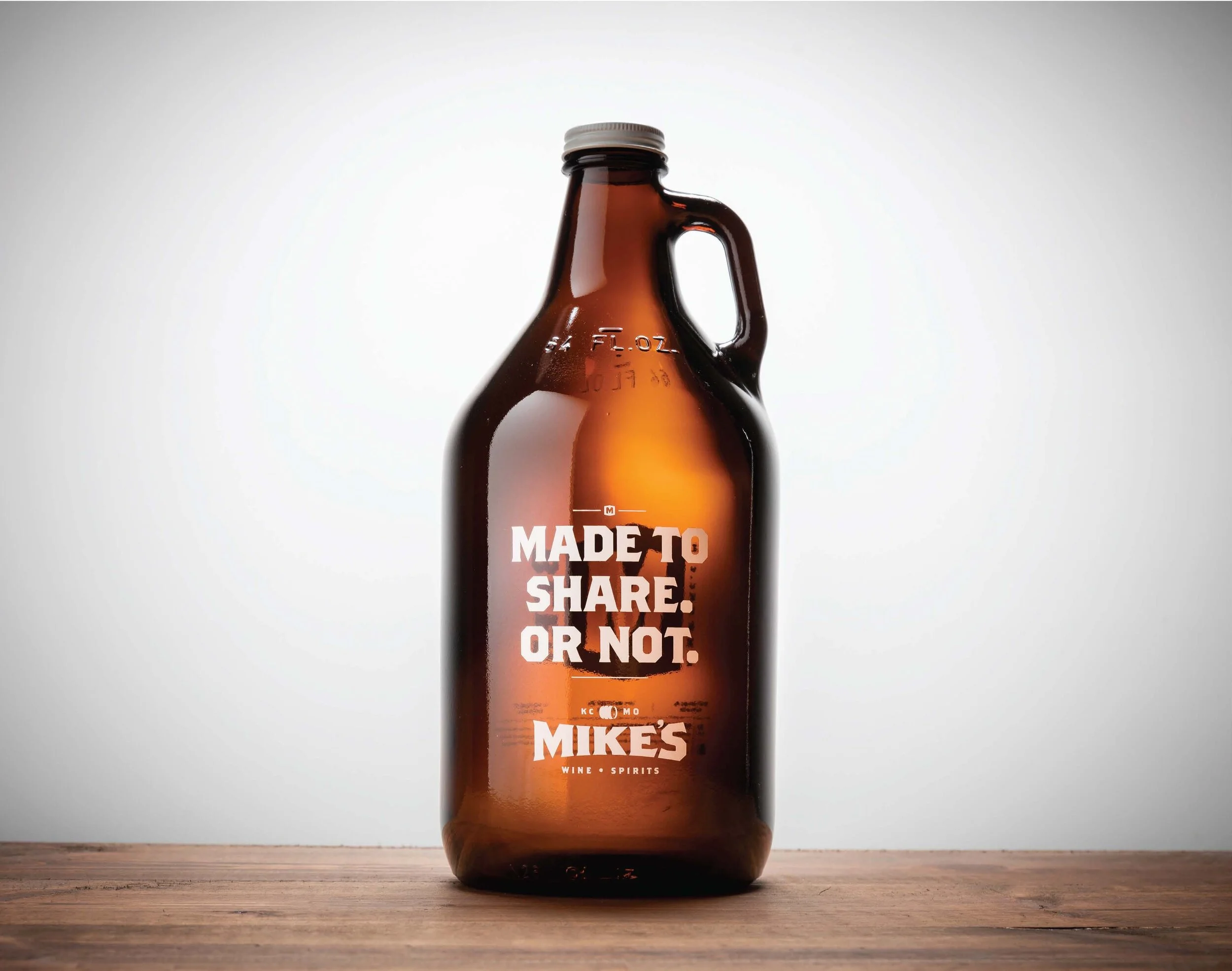
beer growlers
customers still didn’t realize mike’s sold growlers. so, we made new ones that forced people to pay attention to them.


brown bags
thousands of brown bags walk out of mike’s every day. we turned each of them into walking, talking billboards.

swag
no rebranding project is complete without business cards, t-shirts and the obligatory koozie.


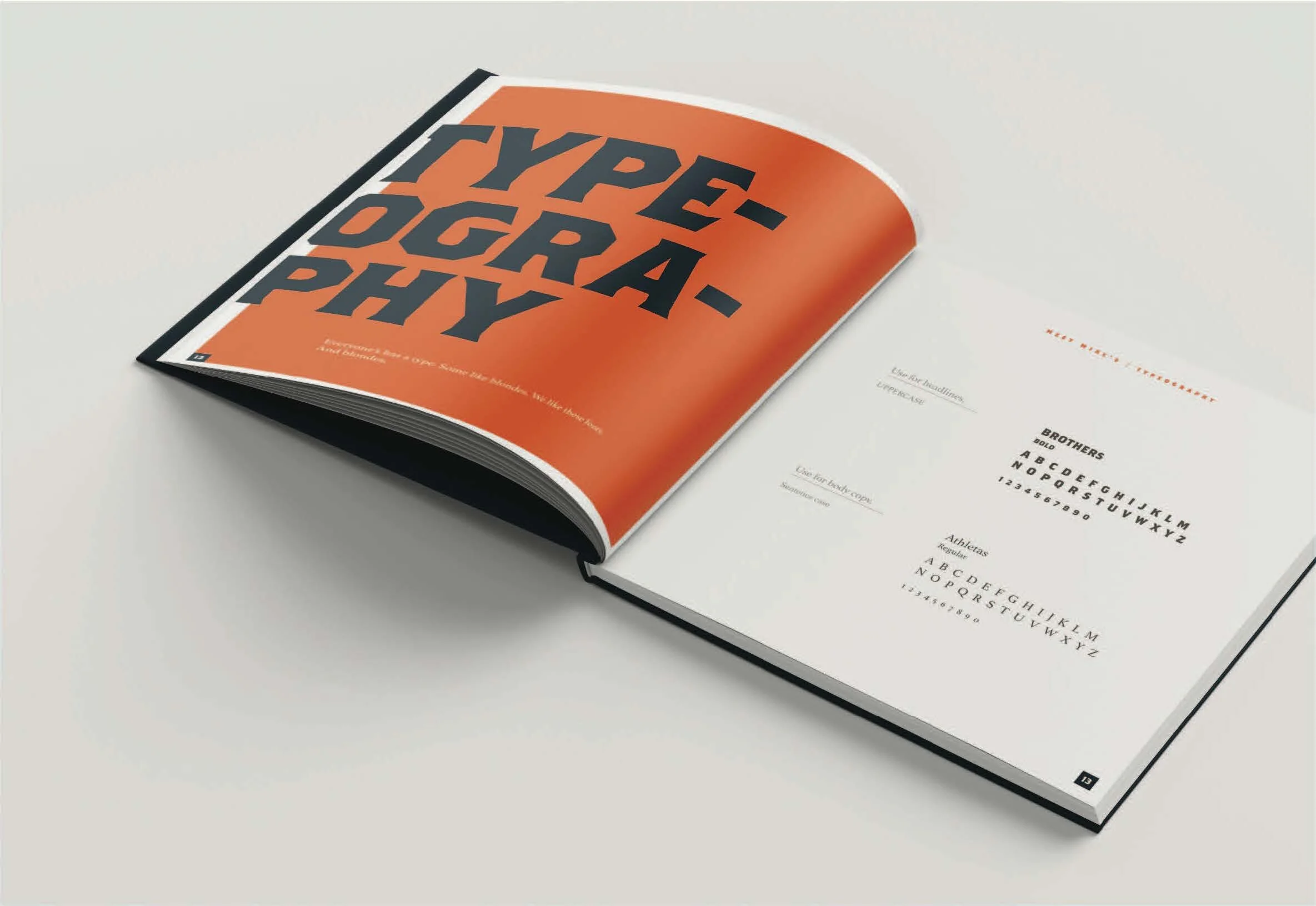
style guide
even the style guide had it’s own attitude

kansas city local addys, gold
midwest regional addys, silver
writer: jonathan vigliaturo
art director: gary schroer
agency: freelance